Display Code
# Read in packages
library(tidyverse)
library(janitor)
library(here)
library(sf)
library(tmap)
library(kableExtra)
library(patchwork)
library(testthat)Present-day environmental justice may reflect legacies of injustice in the past. The United States has a long history of racial segregation which is still visible. During the 1930’s the Home Owners’ Loan Corporation (HOLC), as part of the New Deal, rated neighborhoods based on their perceived safety for real estate investment. Their ranking system, (A (green), B (blue), C (yellow), D (red)) was then used to block access to loans for home ownership. Colloquially known as “redlining”, this practice has had widely-documented consequences not only for community wealth, but also health.1 Redlined neighborhoods have less greenery2 and are hotter than other neighborhoods.
# Read in packages
library(tidyverse)
library(janitor)
library(here)
library(sf)
library(tmap)
library(kableExtra)
library(patchwork)
library(testthat)# Conditional statement to check for coordinate reference systems
if(st_crs(holc) == st_crs(ejscreen_LA) & st_crs(holc) == st_crs(ejscreen)) {
print("It's a match! Coordinate reference systems of datasets match. ")
} else{
warning("Coordinate reference systems do not match. Please transform your data.")
} # STOP here if it does not match, go back and use st_transform()[1] "It's a match! Coordinate reference systems of datasets match. "# Layer shapes using bounding box visualizing LA County and its surrounding counties
tmap_options(check.and.fix = TRUE) # Fixes polygon options for map
tm_shape(ejscreen_LA, # Using LA data, zoom in on areas graded by HOLC
bbox = holc) +
tm_polygons(col = 'moccasin') + # Choose map color for land area in LA
tm_shape(holc) + # Now we want to fill in the HOLC census data
tm_polygons(col = 'grade',
palette = c('A' = 'green4', # Color each grade in order
'B' = 'gold',
'C' = 'darkorange',
'D' = 'red4'),
title = "Grades") + # Legend Title
tm_shape(san_bern) +
tm_polygons(col = 'moccasin') + # San Bernardino to provide map context
tm_shape(orange_county) +
tm_polygons(col = 'moccasin') + # Surrounding counties and filling color
tm_layout(frame = TRUE,
main.title = "Historical Redlining in Los Angeles County",
main.title.position = "center", #center the title
bg.color = "lightblue", # ocean color as background
legend.position = c("left", "bottom"), # want legend in bottom left
fontfamily = "serif", # Select font
legend.title.size = 1) +
tm_scale_bar(position = c(.6, .9)) + # position values tinkered to be in the top right corner
tm_compass(type = "8star", # More detailed compass
position = c(.725, .8), # Position 8 star compass below the scale bar
size = 2.4) 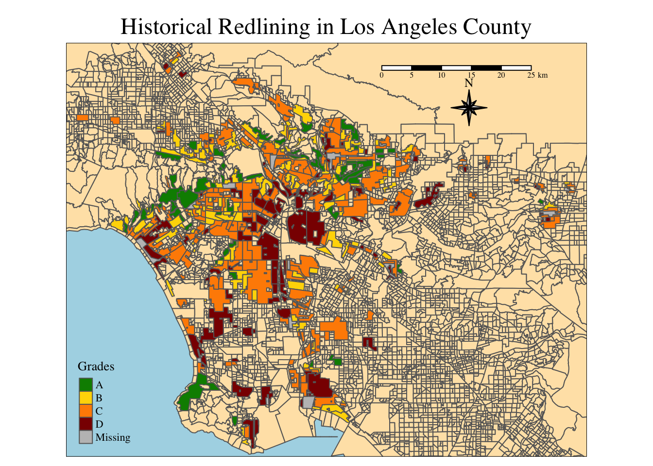
# Create a joined data frame that will be modified to create table and figures
holc_la_join <- st_join(ejscreen_LA, holc, join = st_intersects)# Join datasets for census blocks, add the count of each grade group and divide by number of rows; keep grade and percent
percent_holc <- holc_la_join |> # Use joined data frame as base
group_by(grade) |> # Group data by grade as first step to calculating percent
summarise(count_block = n()) |> # Count each block that was grouped by grade
mutate(percent = (count_block/sum(count_block) * 100) ) |> # calculate percentage by mutating a new column using our summarized count column
ungroup() |> # Avoid errors with ungroup function
st_drop_geometry() # drop geom for our table
test_that("Test that the percentage adds to 100", expect_true(sum(percent_holc$percent) == 100)) # Making sure that percents are correct before putting into tableTest passed 🥳kable(percent_holc, col.names = c("Grade", "Count", "Percent")) # Create visual table for data frame we just created| Grade | Count | Percent |
|---|---|---|
| A | 449 | 4.997218 |
| B | 1239 | 13.789649 |
| C | 3058 | 34.034502 |
| D | 1346 | 14.980523 |
| NA | 2893 | 32.198108 |
# Join if st_intersects is true, so we make sure to look at values of overlapping geometrise
 low_income_join <- holc_la_join  |>
   group_by(grade) |>
   summarise(mean_low_income = (mean(LOWINCPCT) * 100)) |>
  ungroup()

# Plot data
fig1 <- ggplot(low_income_join) +
  geom_col(aes(x = grade, y = mean_low_income,
               fill = grade)) +
  labs(x = "HOLC Grade",
       y = "Average Percent Low Income (%)",
       title = "Percent Low Income Within HOLC Grades") +
  theme_classic() +
  theme(plot.caption = element_text(hjust = -0.15, size = 10, face = "bold"),
        legend.position = 'None') +
  scale_fill_manual(values = c('green4',
                        'gold',
                        'darkorange',
                        'red4',
                        'slategrey'))

fig1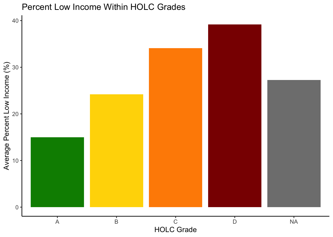
# Create boxplot
fig2 <- ggplot(holc_la_join, aes(x = grade,                          # original joined data frame, we want all the data for holc and ejscreen in LA
                                 y = P_PM25)) +                                  # repeat y for stat summary
  geom_boxplot(aes(x = grade,                                                 # x variable
                   y = P_PM25,                                                # y variable
                   fill = grade)) +                                           # color to be filled by grade
  labs(x = "HOLC Grade",                                                      # HOLC on x label
       y = "Percentile",                                                      # Percentile on y axis
       title = "Particulate Matter 2.5 Across HOLC Grades in Los Angeles County") +                         # title label
  theme_classic() +                                   # blank backghround
  guides(fill = 'none') +                             # Remove our legend that shows diff colors for the individ box plots
  scale_fill_manual(values = c('green2',               # We want colors to align with our maps colors in the order A, B, C, D, NA
                        'gold3',
                        'darkorange2',
                        'red3',
                        'slategrey')) +
  stat_summary(fun = mean,                             # calculates mean function of y based on x
               aes(shape = "Mean Percentile"),          # Label the shape to match up with the scale shape manual
               geom = 'point',                                      # We want the geometry to align with the scale shape manual below
               col = "black",                                    # define color = black
               size = 5.5) +                                              # standout size to make dot bigger than outlier dots
  scale_shape_manual(values=c("Mean Percentile" = 20),                     # Define mean percentile as dot shape number by using arguemnt values
                     guide = guide_legend(' '))                          # Remove shape title


# Figure 3: Percentile for low life expectancy

fig3 <- ggplot(holc_la_join, aes(x = grade,
                                 y = P_LIFEEXPPCT)) +                    # Must define aes here for stat summary at the bottom as well as in geom
  geom_boxplot(aes(x = grade,                                             # grade in LA County
                   y = P_LIFEEXPPCT,                                        # Percentile Life Expectancy
                   fill = grade)) +                                         # Change colors of box plot depending on grade, consistent w/ other figs
  labs(x = "HOLC Grade",                                                      # Relabel x Axis to Home Owner's Loan Corporation(HOLC) grade
       y = "Percentile",                                                      # Relabel axes title so we are looking at percentile
       title = "Low Life Expectancy Across HOLC Grades in Los Angeles County") +   # Define explicit title
  theme_classic() +                                                         # No tick marks, just blank page theme
  scale_fill_manual(values = c('green2',                                      # Green representing A grade
                        'gold3',                                     # yellow representing B grade
                        'darkorange2',                                     # orange representing C grade
                        'red3',                                         # red representing grade = D
                        'lightgrey'))  +                                  # Grey color NA
  guides(fill = 'none') +                                          # Remove legend above for HOLC grades box plots, intuitive so no need
  stat_summary(fun = mean,                                        # We want the function to evaluate the mean out of each grade, defined by x
               aes(shape = "Mean Percentile"),                                      # Assign the label that will show up in manual legend
               geom = 'point',                                            # We want the mean to be visualized as a standout point
               col = "black",                                              # Black dot to represent mean percemtile, consistent with PM 2.5
               size = 5.5) +                                           # Adjust size of the point
  scale_shape_manual(values=c("Mean Percentile" = 20),                  # Mean Percentile assigned to point value which is 20
                     guide = guide_legend(' '))                        # remove shape title


# Use patchwork to see both figs stacked
fig2 / fig3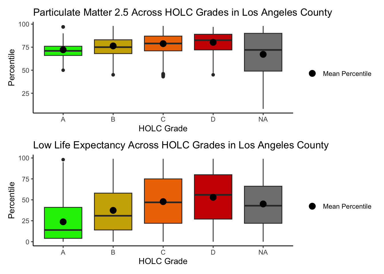
Reflecting on these results, it is noted that there are many missing or NA values that were omitted from the HOLC grade data. These missing values had an average percent low income of about 27.3%. Areas that were graded an A by HOLC had a percent low income of about 15%, which differs significantly with the D graded areas with a percent low income of 39.2%. This places the missing data (making up about 43% of the total 2021 EJScreen LA data) between the highest and lowest grades possible by HOLC. Likewise, these communities are not historically redlined, however may not be necessarily at a strong advantage either.
There is a cascading effect on increasing socioeconomic constraints and negative health effects as the grade decreases. Because of this historical redlining, disadvantaged communities have less available medical resources and closer proximity to hazardous polluting facilities, contributing to the greater levels of air pollutants and low life expectancy.
Looking at the values that were recorded by the Home Owner’s Loan Corporation Grades in the 1930s, about 20% of the overall measured data was in the D range. Unsurprisingly, census tracts that were given a D grade had the highest averages of percent low income, percentile of particulate matter 2.5, and percentile of low life expectancy. Furthermore, these adverse health effects are linked to the historical redlining of marginalized residents, a form of institutionalized racism whose effect is proven in the 2021 EJScreen data.
A recent study found that redlining has not only affected the environments communities are exposed to, it has also shaped our observations of biodiversity.4 Community or citizen science, whereby individuals share observations of species, is generating an enormous volume of data. Ellis-Soto and co-authors found that redlined neighborhoods remain the most undersampled areas across 195 US cities. This gap is highly concerning, because conservation decisions are made based on these data.
if(expect_true(st_crs(birds) == st_crs(holc))) {
  print("It's a match! Coordinate reference systems of datsets match. ")
} else{
  warning("Coordinate reference systems do not match. Please transform your data.")
}
[1] "It's a match! Coordinate reference systems of datsets match. "# Join DF
bird_holc_join <- st_join(holc, birds, st_intersects) |>
filter(grade != 'NA') |>
group_by(grade) |>
summarise(bird_count= n()) |>
mutate(percent_obs = (bird_count/sum(bird_count) * 100)) |> # Mutate new colummn
st_drop_geometry() |>
ungroup() # Avoid further errors if we wanted to perform more functions
# Test function to make sure that the bird observation percentages are TRUE
test_that("Test that the percentage of bird observations add to 100.", expect_true(sum(bird_holc_join$percent_obs) == 100)) Test passed 🥇# Plot data!
ggplot(bird_holc_join, aes(x = grade, y = percent_obs)) +
geom_col(fill = c('green4',
'gold',
'darkorange',
'red4')) +
labs(title = 'Percent of Bird Observations by LA HOLC Grades in 2022', # Title
x = 'HOLC Grade', # holc grade on x
y = 'Percent of Observations') +
theme_classic() # Blank background for sleekness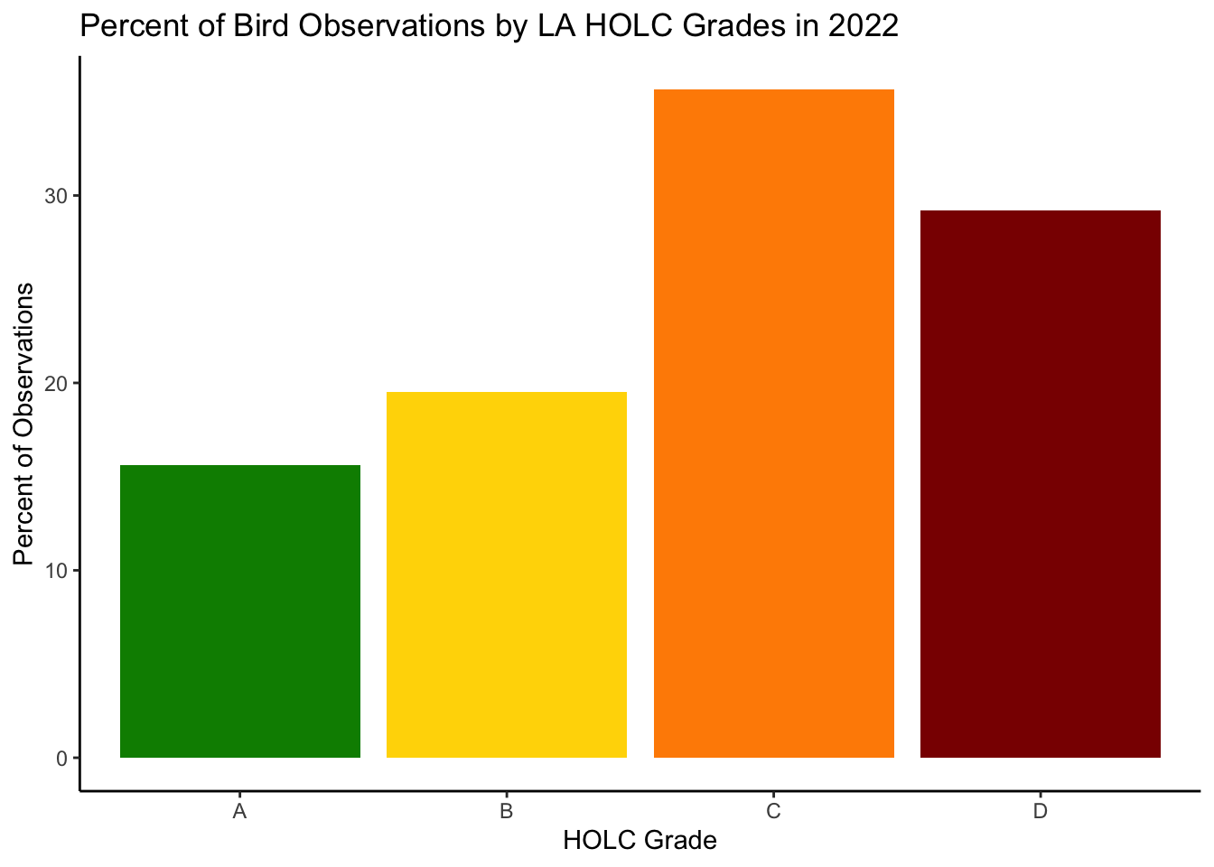
Looking at the bird data, the bar plot shows that the highest percentage of bird observations is found in the C graded areas. The second highest percentage of bird observations is found in the D graded areas, which does not match with the findings in Ellis-Soto et al. 2023. The highest number of observations were found in both areas of HOLC grades C and D. Ellis-Soto and co authors found that these redlined areas were the most undersampled, and while this may still be true, the biodiversity data based on bird observations is not true. However, the concerns for undersampled areas influencing conservation decisions remain important to the conversation of adverse impacts as a result of historical redlining. Environmental injustices as such create additional barriers to biodiversity access, and it should be considered that there may bias as to how this biodiversity data was collected in redlined areas. For example, the Biden Administration has authorized federal and state governments to focus on historically neglected areas to increase conservation efforts, potentially could have influenced the greater amount of bird observations in 2022 within these redlined areas.
Citations:
Ellis-Soto, D., Chapman, M., & Locke, D. H. (2023). Historical redlining is associated with increasing geographical disparities in bird biodiversity sampling in the United States. Nature Human Behaviour.
Federal Loan Agency. Federal Home Loan Bank Board. Home Owners’ Loan Corporation. (07/01/1939 - 02/24/1942).
U.S. Environmental Protection Agency (EPA), 2023. EJScreen Technical Documentation.
Global Biodiversity Information Facility (GBIF). Biodiversity Data.