library(tidyverse)
library(here)
library(janitor)
library(modelr)
library(knitr)
library(broom)

options(scipen = 999)Background: Electrolysis is the process in which electricity is used to split water molecules into hydrogen and oxygen. There are several potential health implications for this energy process, when powered by natural gas. This process by which steam methane reforming is used emits potent greenhouse gases.
However, electrolysis can also be fueled by renewable power. This is known as green hydrogen, and it does not require fossil fuels nor results in greenhouse gas emissions. According to the Natural Resources Defense Council (NRDC), ’while the technology is still in the early stages, falling renewable energy prices, along with the decreasing costs of the electrolyzers themselves and the clean hydrogen tax credit within the Inflation Reduction Act (IRA), could make this type of electrolysis cost competitive with other methods” (NRDC).
Analysis Questions:
Is there a higher overall potential for green hydrogen with wind or solar?
As population and area increases, does the potential for hydrogen fuel increase as well?
Analysis Plan:
In this analysis, I plan to test both of my hypothesis by choosing a test statistic for my sample, and quantify the uncertainty with a null distribution. Next, I will calculate this test statistic as a point estimate up against my null distribution to visualize where the point lies. This will then allow me to find the P-Value, at which point I will reject or fail to reject the null hypothesis. Proceeding these tests, I want to visualize my data. I will compare the potentials of both solar and wind with regards to population. I am also curious at the R-squared, to see how strong this correlation is. I will add area as a predictor variable to test for an omitted variable bias, and discuss my results. This discussion will compare my plot results, and the R-squared of both linear models. I will add any additional visualizations in the case that it is needed to help see my results. This analysis ends with a discussion on the limitations of this study.
Load libraries
Import data
 #| code-fold: true
#| code-summary: 'Display Code'
solar_h2_potential <- read_csv(here('posts', 'green-hydrogen-blog', 'data', 'H2_Potential_from_Solar', 'H2_Potential_from_Solar.csv'))
wind_h2_potential <- read_csv(here('posts', 'green-hydrogen-blog','data', 'H2_Potential_from_Wind', 'H2_Potential_from_Wind.csv'))
About the Data
This data was accessed through the National Renewable Energy Laboratory (NREL). NREL provided two datasets of the hydrogen utility potential generated from both wind and solar. The methodoloy outlined in the metadata mentions how the potential is determined for both the wind and solar power sources. The metadata states in explicit detail that the amount of wind and solar power required to produce 1 kg of Hydrogen is 58.8 kWh. Due to these conversion rates being the same, I was able to compare these resources across one joined dataset.
The land use assumption for PV cells states that only 10% of a 40 km × 40 km cell’s land area is assumed to be available for photovoltaic development. Within this 10%, only 30% of the area will be covered by solar panels. The electrolysis system requires 58.8 kWh to produce one kg of hydrogen.
For onshore and offshore wind, the metadata identifies that the wind power uses the same production rate of 58.8 kWh/kg. For wind power, the study normalized hydrogen potential by county area (sq km) to ensure comparability across counties of different sizes. The normalization process minimizes biases introduced by geographic area, enabling a clearer understanding of regional potential based on renewable resource availability and efficiency. In other words, the potential to produce hydrogen from wind was normalized by county area to minimize differences in values based on the size of areas.
Data Wrangling
In this code chunk, I began with a full join of both my solar hydrogen potential and wind hydrogen potential dataframes. For consistency, I used clean_names() with the janitor package. Both dataframes are organized by state, area in square km, population in 2010, and hydrogen potential in kg per year. I grouped by state so that I could take the sum of each column that I am interested in, removing all NA values. I made sure to ungroup() to avoid errors later on. I needed to pivot my data frame into utility potential in kg per year and type of renewable resource that produced the hydrogen.
Display Code
h2_potential <- full_join(solar_h2_potential, wind_h2_potential) |>
  clean_names() |>
   group_by(state) |>
  summarise_at(vars(population_in_2010, area_sq_km, total_utility_pv_hydrogen_potential_kg_yr, total_onshore_offshore_hydrogen_potential_kg_yr), sum, na.rm = TRUE) |>
  ungroup() |>
  pivot_longer(cols = c(total_utility_pv_hydrogen_potential_kg_yr,
             total_onshore_offshore_hydrogen_potential_kg_yr),
    names_to = c("category", "type"),
    names_sep = "_",
    values_to = "value"
  ) |>
   mutate(type = case_when(
    type == "utility" ~ "pv_solar",
    type == "onshore" ~ "wind_onshore_offshore",
    TRUE ~ type
  )) |>
  rename(h2_potential_kg_yr = value) |>
  select(!category)
Hypothesis Testing
Great! Now that my data is formatted correctly, it is time to start my analyses.
H0: Type of renewable energy source has no effect on hydrogen fuel potential.
HA: Type of renewable energy source has an effect on hydrogen fuel potential.
Test Statistic: Difference of means
Display Code
utility <- h2_potential |>
  group_by(type) |>
  summarize(avg_potential = mean(h2_potential_kg_yr))

point_estimate_h2 <- utility$avg_potential[2] - utility$avg_potential[1]

point_estimate_h2
[1] -110387667767Display Code
null_dist <- replicate(1000, {
  utility <- h2_potential |>
  mutate(type = sample(type, n())) |>
  group_by(type) |>
  summarize(avg_potential = mean(h2_potential_kg_yr))

  point_estimate_h2 <- utility$avg_potential[2] - utility$avg_potential[1]

  point_estimate_h2
})

ggplot(tibble(null_dist), aes(null_dist)) +
  geom_histogram(bins = 20, color = 'darkgreen',
                 fill = NA) +
  geom_vline(xintercept = point_estimate_h2,
             color = 'red') +
  theme_minimal() +
  labs(title = 'Randomization Test')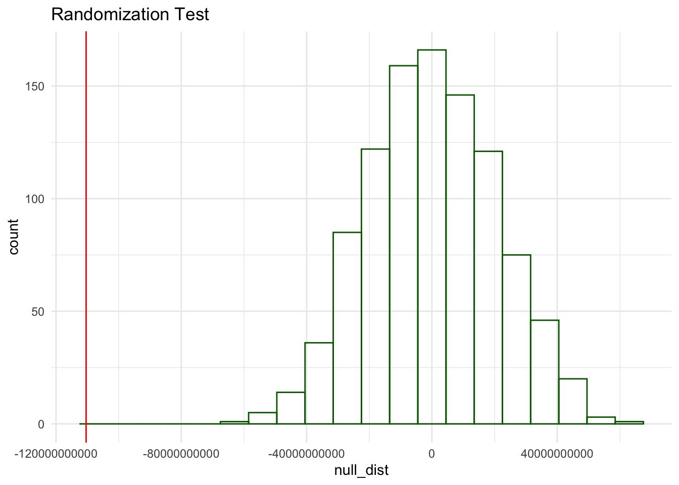
To quantify the uncertainty, I created a null distribution as seen above, and made sure to calculate the point estimate with our difference in means. The point estimate is clearly located to the far left of the distribution, so we can see how this compares with our P-Value. Below our P-Value is calculated and it is so significant that it comes out to 0.
P-Value
Display Code
sum(abs(null_dist) > abs(point_estimate_h2)) /
  length(null_dist)
[1] 0Reject the H0
Based on the results of the analysis, I reject the null hypothesis that the type of renewable energy source has no effect on hydrogen fuel potential. This indicates that the type of renewable energy source significantly influences hydrogen fuel potential.
Linear Regression Model
Now, we want to know how the type of source and population influence the hydrogen fuel potential using a linear model. I decided to use a linear regression model because my dependent variable is numerically trying to predict the hydrogen potential based on population and source type. The two predictors are population in 2010 and source type, which are continuous and categorical.
Display Code
# Fit linear model
linear_model <- summary(lm(h2_potential_kg_yr ~ population_in_2010 + type, data = h2_potential))

print(linear_model)
Call:
lm(formula = h2_potential_kg_yr ~ population_in_2010 + type,
    data = h2_potential)

Residuals:
          Min            1Q        Median            3Q           Max
-120416082360  -34642132855    -320783583   13920485720  616953246477

Coefficients:
                               Estimate    Std. Error t value      Pr(>|t|)
(Intercept)                 92563489433   14486503152   6.390 0.00000000546 ***
population_in_2010                 3032          1281   2.368        0.0198 *
typewind_onshore_offshore -110387667766   17306566704  -6.378 0.00000000576 ***
---
Signif. codes:  0 '***' 0.001 '**' 0.01 '*' 0.05 '.' 0.1 ' ' 1

Residual standard error: 87390000000 on 99 degrees of freedom
Multiple R-squared:  0.3186,    Adjusted R-squared:  0.3048
F-statistic: 23.14 on 2 and 99 DF,  p-value: 0.000000005666
Note the R-squared here is 0.3048. Pretty low, right? Let’s look at the plot and then we can consider an omitted variable bias.
Display Code
# Examine the p-values for the "2010 population" and "type" coefficients
ggplot(h2_potential, aes(population_in_2010,
                         h2_potential_kg_yr,
                         color = factor(type))) +
  geom_point(size = 2, alpha = 0.7) +
  geom_smooth(se = FALSE, method = 'lm', linetype = "dashed", size = 1) +
  scale_color_manual(values = c(
      "pv_solar" = "orange",
      "wind_onshore_offshore" = "cornflowerblue"
    ),
    labels = c(
      "pv_solar" = "Solar",
      "wind_onshore_offshore" = "Land and Offshore Wind")) +
 scale_y_continuous(labels = scales::label_number(scale = 1e-3, suffix = "K")) + # alternative
  theme_light() +
  labs(title = 'Green Hydrogen Fuel Potential \nin the United States using 2010 Population',
       x = 'Population in 2010',
       y = 'Hydrogen Potential (kg/year)',
       color = 'Type of Renewable Energy Source') +
  theme(plot.title = element_text(size = 14, face = "bold", lineheight = 1.2),
        axis.title = element_text(size = 12),
        axis.text = element_text(size = 10)) +
  theme(legend.position = 'bottom')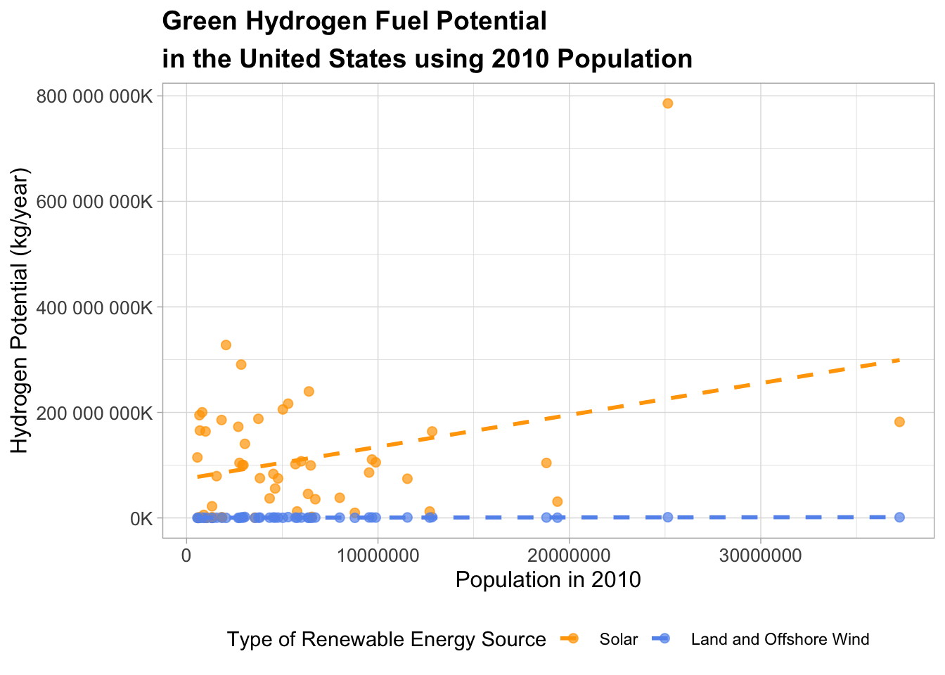
Display Code
  # geom_point() +
  # geom_smooth(se =FALSE, method = 'lm') +
  # theme_light() +
  # labs(title = 'Green Hydrogen Fuel Potential \nin the United States using 2010 Population',
  #      x = 'Population in 2010',
  #      y = 'Hydrogen Potential (kg/year)',
  #      color = 'Type of Renewable Energy Source')
This plot shows that solar has a higher overall potential for producing hydrogen fuel based on the population in 2010 across the United States. We can see that even in the data itself, solar has greater values overall. This may be because existing PV cells are way more abundant in amount due to their smaller size and lower production/installation costs, despite wind . Whereas both offshore and onshore wind turbines are extremely large, with a single wind turbine blade equaling the length of a single football field. This not only confirms our initial hypothesis testing, but it confirms our initial question. On average, solar power is likely to have a greater overall potential for producing hydrogen as a renewable energy source than wind.
An interesting thing I’d like to point out about this plot is our outlier. You may be wondering, what is that in the top right? This value is the hydrogen potential in kg per year for solar pv cells in Texas. The Texas population is 25,145,561 in 2010. The hydrogen potential for solar in Texas is 785,765,312,659 kg per year. Conversely, the onshore or offshore wind source for hydrogen potential in Texas at this same population is 1,320,799,106 kg per year. Clearly there is a significant difference in the potentials for both technologies likely due to the greater cost incentives and size of existing solar pv cells. This makes intuitive sense because of Texas’s notorious solar resource and lots of land. This makes me to think that perhaps area may be a better predictor of this study.
This leads me to my next question regarding an added variable:
As population and area increases, does the potential for hydrogen fuel increase as well?
Omitted Variable Bias
Now, that we have seen that solar has a greater overall potential for producing hydrogen, I am curious to see if there is an omitted variable bias in the previous model. I want to include the land area per state to see if there is a stronger predictor.
Note: The raw data is listed in kg per year, indicating that this is the Total Hydrogen Potential as opposed to the Normalized potential, which would be in kg/yr/km2. With this in mind, it is fair to test if there is an omitted variable bias for area by state due to it not being included to calculate the potential itself.
Display Code
fit2 <- lm(h2_potential_kg_yr ~ population_in_2010 + type + area_sq_km, data = h2_potential)
summary(fit2)
Call:
lm(formula = h2_potential_kg_yr ~ population_in_2010 + type +
    area_sq_km, data = h2_potential)

Residuals:
          Min            1Q        Median            3Q           Max
-169600751896  -34475690163    -431361453   17028955137  559694315767

Coefficients:
                               Estimate    Std. Error t value       Pr(>|t|)
(Intercept)                 71275891445   14772147915   4.825 0.000005142621
population_in_2010                 2408          1216   1.980       0.050491
typewind_onshore_offshore -110387667766   16277536316  -6.782 0.000000000904
area_sq_km                       137234         36792   3.730       0.000321

(Intercept)               ***
population_in_2010        .
typewind_onshore_offshore ***
area_sq_km                ***
---
Signif. codes:  0 '***' 0.001 '**' 0.01 '*' 0.05 '.' 0.1 ' ' 1

Residual standard error: 82200000000 on 98 degrees of freedom
Multiple R-squared:  0.4033,    Adjusted R-squared:  0.385
F-statistic: 22.08 on 3 and 98 DF,  p-value: 0.00000000005266
Here we see that the adjusted R-squared is 0.385. While this correlation is still fairly weak,it increased when area was added. This leads me to believe that perhaps there still is an omitted variable bias that is not included in the data. For future studies, it may be valuable to use data on solar radiation or average wind speeds in each of these states and compare separately by type.
Display Code
h2_potential |>
  filter(type == 'wind_onshore_offshore') |>
  ggplot(aes(x = area_sq_km,
                         y = h2_potential_kg_yr)) +
  geom_point() +
  geom_smooth(method = 'lm', se = FALSE) +
  theme_classic() +
  labs(x = 'Area (sq km)',
       y = 'H2 Potential (kg/year)',
       title = 'Hydrogen Potential for Onshore and Offshore Wind')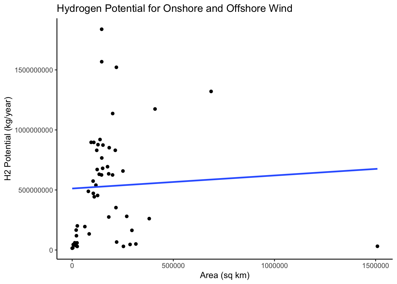
Because our previous combined plot was hard to decipher the values for wind hydrogen potential, I wanted to examine the relationship between just wind and area, and just wind and population in 2010. Using geom_smooth() it is clear that the line is less steep and positive. Let’s look at the distribution between population and Hydrogen potential.
Display Code
h2_potential |>
  filter(type == 'wind_onshore_offshore') |>
  ggplot(aes(x = population_in_2010,
                         y = h2_potential_kg_yr)) +
  geom_point() +
  geom_smooth(method = 'lm', se = FALSE) +
  theme_classic() +
  labs(x = 'Population in 2010',
       y = 'H2 Potential (kg/year)',
       title = 'Hydrogen Potential i for Onshore and Offshore Wind')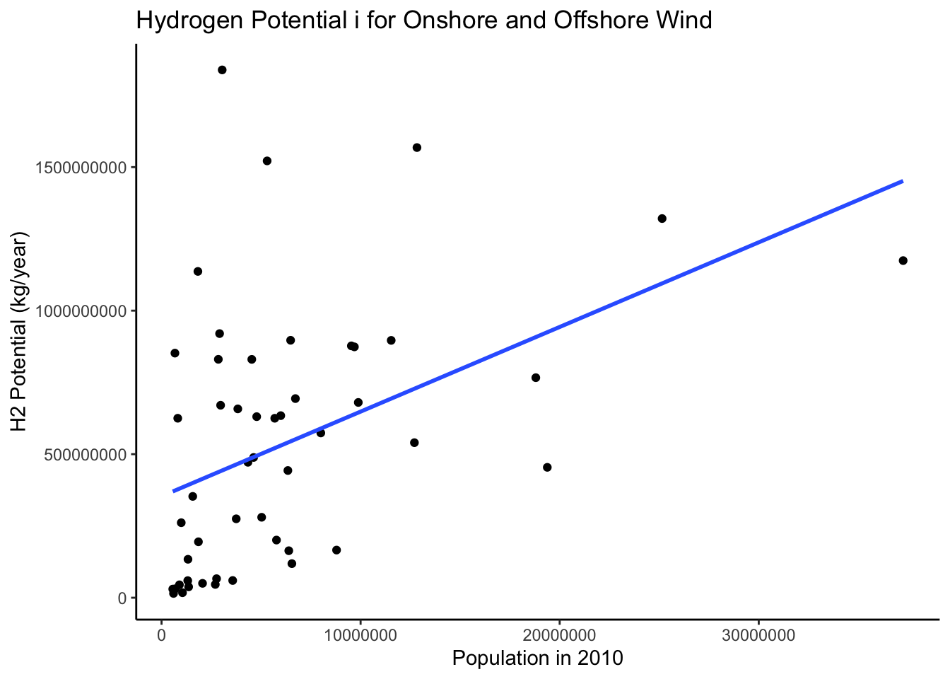
Here, we can see that the slope is more positive and looks generally more normally distributed. This makes sense because the population sizes are dynamic while state area is a fixed value per state.
Display Code
h2_potential |>
  filter(type == 'pv_solar') |>
  ggplot(aes(x = area_sq_km,
                         y = h2_potential_kg_yr)) +
  geom_point() +
  geom_smooth(method = 'lm', se = FALSE) +
  theme_classic() +
  labs(x = 'Area (sq km)',
       y = 'H2 Potential (kg/year)',
       title = 'Hydrogen Potential in US States for Solar PV Sources')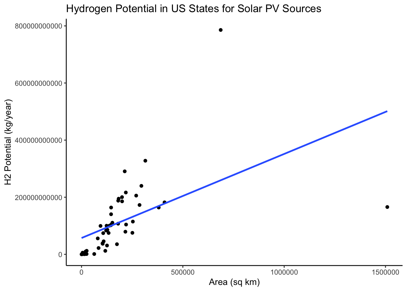
Out of curiosity, I wanted to see the distribution of area and hydrogen potential. This is very interesting to me because it appears that the residuals are smaller, with the two outliers as exceptions. Similarly, this line has a positive slope.
Limitations
This study is limited by the scope of the data. Considering that the data includes the population from 2010, the values of hydrogen potential and population have likely had significant changes since then. The sampling strategy of the data utilized satellite imagery and identified land areas that are designated for wind and solar production, and eliminated small clean energy wind and solar plants that would not generate enough energy to power the hydrogen plants. The limitations of this are that there is not a ton of explanation further about the data and it is generally not clear about their inclusions other than these existing technology designations and the conversion rate. With the new presidency, there may be less incentives for green hydrogen and further studies may need to be conducted to predict more updated potential values.
Assumptions
This data assumes that green hydrogen is produced purely through electrolysis, without any dirty methods of producing energy involved. It should be noted that many hydrogen projects being developed are often times not purely generated through electrolysis, and thus has adverse health and environmental impacts.
References
Resource Assessment for Hydrogen Production. M. Melaina, M. Peneve, and D Heimiller. September 2013. NREL TP-5400-55626