Visualizing Harsh Climate Feedback Loops in the Arctic
When given the opportunity to pick any data source to visualize in an infographic format, I knew that I wanted to do something “cool…
R
Data Viz
Affinity Designer
NOAA
Author
Brooke Grazda
Published
March 15, 2025
”
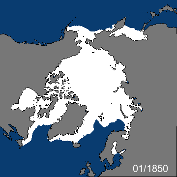
Arctic sea ice extent from 1800s to present
Puns aside, I have always been fascinated with Arctic. Climate change is the focal point of my academic and professional interests. With that being said, I knew the findings would be alarming when I first began visualizing arctic data. The Arctic is home to so many fragile and critical ecosystems that are essential indicators of global climate health. While it was apparent to me from the getgo, I was still shocked to see such drastic changes over many years. As a former environmental educator, I wanted to aim this infographic to students or anybody that would be interested in exploring this topic.
I began with the question: how has Arctic sea ice changed in the last 40 years? This is a very broad question, and there are likely innumerable different pathways to which this question could be answered. Using the NOAA database, I came across a zip file that had so much data on sea ice extent, going all the way back to 1980. I also found a supplementary dataset from the NSF Arctic Data Center on arctic permafrost active layer thickness. The goal of my visualization was to not only answer this question, but tell a visually pleasing, data-driven story about climate change. I was only just dipping my toes in this data, and it was just the tip of the iceberg.
Infographic
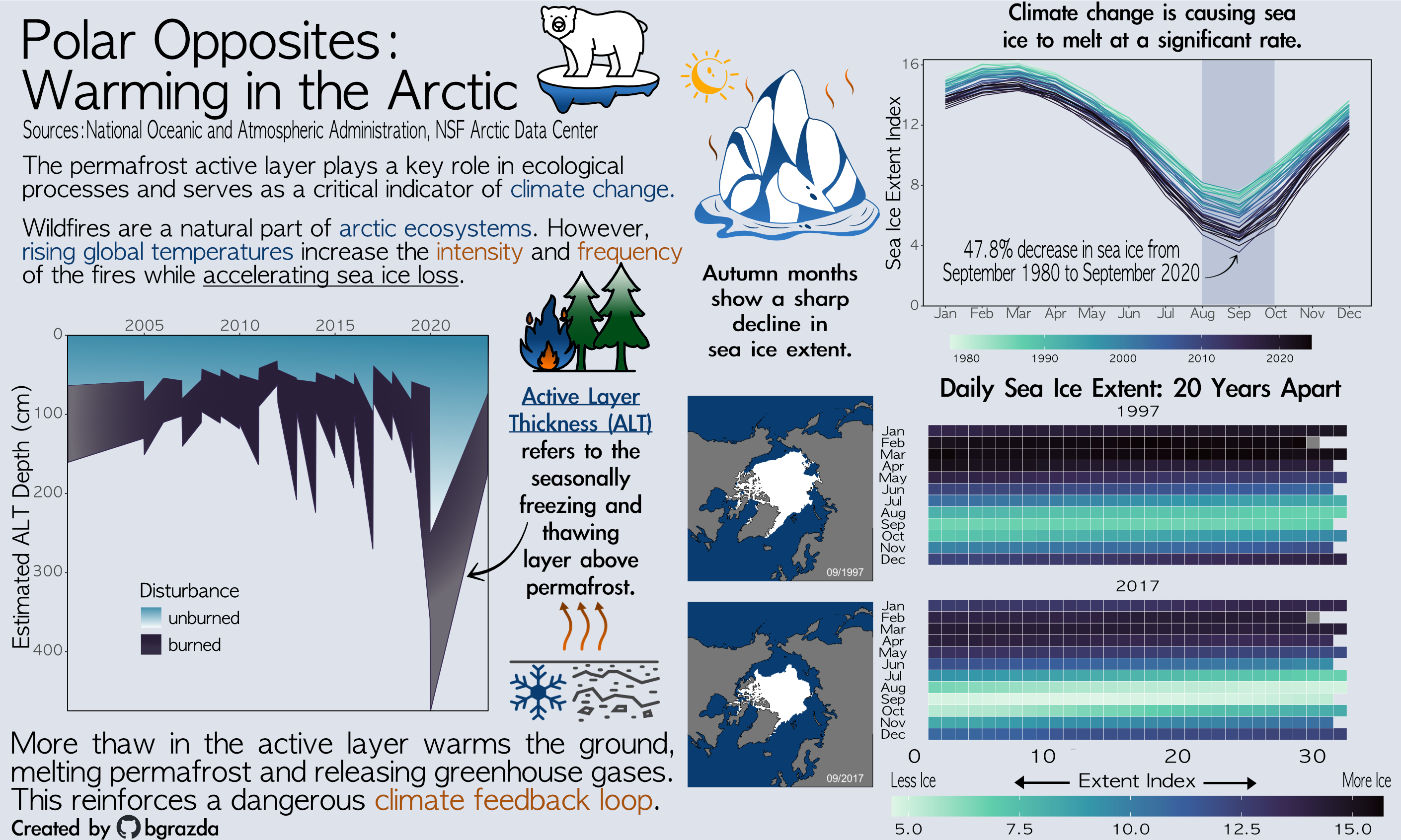
Infographic: Breaking the Ice - Data Visualizations on sea ice extent and permafrost active layer
The Process
While I am no expert in arctic data, I sure did have fun making these visualizations! My dataset from NOAA came with monthly images of the arctic circle, so I turned it into a gif using the following code and attached it to the top of this blog post.
It felt like a no brainer to me to make a heatmap when I saw that my dataset had daily sea ice data. Using the colorblind friendly Viridis color gradients, I wanted my plots to look as icy as possible. I selected the Mako option when plotting all three of my viz. Looking at the heatmap 20 years apart, it was crazy to see how much the index dropped in September, October, and November. These seasonal fluctuations became a theme in my infographic, as I tried to contextualize my other plots with the same idea. Because it wasn’t clear to me what these index values meant, I used the same images in the gif to display alongside the heatmap.
The line plot has yearly data showing these month to month fluctuations, in a different format than before. We can easily see that there is an ebb and flow at different parts of the year, but I wanted to know just how much reduction there was at the lowest point. Using the data from 1980, I was able to calculate that there was a 47.8% reduction in sea ice extent. That statistic was too insane to not include as an annotation!
I was really excited about including some visualization about permafrost, because it is a striking and extremely interesting issue. This is where I found the supplementary dataset from the NSF Arctic Data Center. I learned a lot about different components of permafrost, mostly the uppermost active layer. As stated in the infographic, this is the uppermost part of the permafrost that freezes and thaws throughout the year. I never even considered that there are wildfires occurring in the Arctic, although in retrospect is rather silly. With increased disturbance, the active layer thickens and creates more thaw in permafrost, allowing warmer temperatures to permeate the ground surface. I selected a stacked area chart with flipped axes to make it look iceberg and icicle-like.
One of the hardest decisions to make in this exercise was choosing a typeface. There are so many options, but the AppleGothic typeface was the first one to speak to me. I began using this directly in my plots, but when I began combining all of my plots in Affinity, I needed a bolder face that could highlight certain captions. That is when I found the Apple LiGothic typeface to bolden important components of my infographic. For my themes, I removed all backgrounds so that when I transferred it to Affinity, I could have a uniform slate to work with. This included the type face, mako color scheme, and spacing throughout all plots.
When putting it all on the infographic, it made sense for me to combine the two plots that showed the NOAA sea ice extent data in a stacked format. This gave me limited space on the left to tell the story of permafrost and how it relates to sea ice extent reduction. The underpinning factor in all of my plots is climate change, so I framed each textbox to highlight different aspects of this. My main takeaway is in slightly larger at the bottom, with the entire graphic intentionally meant to be read top to bottom, left to right. This primary message was that this arctic sea ice dilemma is startling because of its furthering impacts on climate change. The organic carbon stored in arctic permafrost releases into the atmosphere once it is exposed through the active layer thickening. The reduction in sea ice is meant to provide context for how fast and when this sea ice changes the most.
I wanted to frame my question as broadly as possible, and while this data is quite quantitative, the ecosystems and communities that live in these environments are experiencing and seeing these changes firsthand. It is one thing to look at a dataset and visualize it, but to experience such loss is a tragedy that is often overlooked and understudied. I hope that these visualizations are able to provide the viewer with context and inspire an initiative to further the conversation about how climate change is impacting communities in different ways around the globe.
Please see below to explore my full code!
Display Code
library(tidyverse)library(here)library(tmap)library(sf)library(ggExtra)library(patchwork)# Load dataice_area <-read_csv(here('sea_ice_data', 'sibt_areas_v2.csv'))ice_extent <-read_csv(here('sea_ice_data', 'sibt_extents_v2.csv')) ice_monthly <- readxl::read_excel(here("sea_ice_data", "Sea_Ice_Index_Monthly_Data_by_Year_G02135_v3.0.xlsx"))roc_arctic <- readxl::read_excel(here("sea_ice_data", "Sea_Ice_Index_Rates_of_Change_G02135_v3.0.xlsx"))shapefile <-read_sf(here('ARPA_polygon', 'ARPA_polygon.shp'))latlong <- readxl::read_xlsx(here('sea_ice_data', 'arctic_regions_latlong.xlsx'))biomes <-read_csv(here::here('data', 'FireALTEstimatedPairsBurnedUnburned.csv'))daily <- readxl::read_xlsx(here('sea_ice_data', 'Sea_Ice_Index_Daily_Extent_G02135_v3.0.xlsx'))# Background color of infographicinfo_bg ='#f4f4f9'# Tidy daily ice datadaily_tidy <- daily |>pivot_longer(cols =c(3:53), names_to ='year', values_to ='extent_index') |>#filter(!is.na(...1)) |> rename(month = ...1, day = ...2) |>mutate(month =factor(month, levels = month.name, labels = month.abb), # Optional: Convert to abbreviated month namesday =as.numeric(day) # Ensure day is numeric ) |>fill(month, .direction ="down") |>mutate(year =as.numeric(str_extract(year, "\\d+"))) |>filter(year %in%c(1997, 2017))# Make heatmap for daily ice dataggplot(daily_tidy, aes(x = day, y = month, fill = extent_index)) +geom_tile(color ='white') +# Use white borders between tilesscale_fill_viridis_c(option ="mako", name ="Extent Index", direction =-1) +# Adjust color scalefacet_wrap(~year, ncol =1) +# Separate heatmaps for each yeartheme_minimal() +coord_fixed() +labs(title ="Daily Arctic Sea Ice Extent: 20 Years Apart",x ="Day of the Month",y ="",caption ="Autumn months show a sharp decline in sea ice extent." ) +scale_y_discrete(limits=rev, expand =expansion(mult =c(0.1, 0.1))) +theme_void() +theme(axis.text.x =element_text(hjust =1), # Rotate x-axis labels for readabilitylegend.position ="bottom",legend.title.position ='top',legend.title =element_text(hjust = .5),text=element_text(size=15, family="AppleGothic"),plot.caption =element_text(hjust = .5, margin =margin(0.75, 0, 0, 0, 'cm')),title =element_text(hjust = .5),legend.key.width =unit(2.5, "cm"), axis.text.y =element_text(size =10, lineheight =2, margin =margin(2, 0, 2 ,0, 'cm')), plot.title =element_text(hjust =0.5, size =15,margin =margin(0,0, 0.3, 0, 'cm')),plot.background =element_rect(fill = info_bg, color = info_bg),panel.background =element_rect(fill = info_bg, color = info_bg),legend.background =element_rect(fill = info_bg, color = info_bg),plot.margin =unit(c(.5,1.5,0,0.5), "cm") ) ggsave(plot =last_plot(), filename ='daily_sea_ice.svg', width =10, height =6)# Rename first column as "YYYYDDD" and the rest based on the first rowcolnames(ice_extent) <- ice_extent[1,]ice_extent <- ice_extent[-1,] # Remove the row used for column names# Remove the first row (which contains "RegnArea")ice_area_cleaned <- ice_area[-1, ]# Convert to long formatextent_tidy_locs <- ice_extent %>%pivot_longer(cols =2:18, names_to ="Region", values_to ="ice_extent") %>%slice(-(1:18)) |># Fine to start with year 1850mutate(#YYYDDD = (as.string(YYYYDDD)),ice_extent =as.numeric(ice_extent)) |># extent in square kilometers mutate(year =sub("^(.{4}).*", "\\1", YYYYDDD)) |>select(-YYYYDDD) |>group_by(Region, year) |>summarise(ice_ave =mean(ice_extent)) |>ungroup() |>mutate(region =str_trim(Region)) |>filter(Region !='Northern_Hemisphere') |>left_join(latlong)# Tidy datatidy_monthly_ice <- ice_monthly |> janitor::clean_names() |>rename(year = x1) |>select(-x14) |>pivot_longer(cols =2:13,names_to ="month", values_to ="ice_extent") |>mutate(month =str_to_title(month)) |># Capitalize first lettermutate(month =factor(month, levels = month.name, labels = month.abb)) |>arrange(year) |>mutate(percent_change = (ice_extent -lag(ice_extent)) /lag(ice_extent) *100)# Filter the rows for January 1980 and January 2020ice_extent_1980 <- tidy_monthly_ice %>%filter(year ==1980& month =='Sep') %>%pull(ice_extent)ice_extent_2020 <- tidy_monthly_ice %>%filter(year ==2020& month =='Sep') %>%pull(ice_extent)# Calculate the percent change from January 1980 to January 2020percent_change_from_1980_to_2020 <- (ice_extent_2020 - ice_extent_1980) / ice_extent_1980 *100print(paste("Percent change from September 1980 to September 2020:", round(percent_change_from_1980_to_2020, 2), "%"))# Line plot with yearly ice dataggplot(tidy_monthly_ice, aes(x = month, y = ice_extent, group = year, colour = year)) +geom_line(size = .5) +scale_color_viridis_c(option ='mako', direction =-1) +scale_y_continuous(limits =c(0, NA), expand =c(0, 0)) +theme_classic() +labs(y ='Sea Ice Extent Index',title ='Arctic Sea Ice On The Decline',x =' ',caption ='',color ='Year') +theme(legend.position ='bottom',#legend.box.margin = margin(t = 10, r = 10, b = 10, l = 10), # Adjusts legend margins# plot.margin = margin(t = 15, r = 15, b = 15, l = 15),legend.key.width =unit(3, "cm"), # Stretches legend keys (adjust as needed)#legend.spacing.x = unit(0.5, "cm"),text=element_text(size=15, family="AppleGothic"),legend.title =element_blank(),plot.title =element_text(hjust =0.5),plot.caption =element_text(hjust =0.5),plot.background =element_rect(fill = info_bg, color = info_bg),panel.background =element_rect(fill = info_bg, color = info_bg),legend.background =element_rect(fill = info_bg, color = info_bg) )ggsave(plot =last_plot(), filename ='sea_ice_decline.png', height =6, width =8)# Permafrost plotggplot(biomes) +geom_area(aes(x = year, y = estDepth, fill = distur)) +scale_fill_manual(values =c('#0B0405FF', '#3487A6FF')) +theme_classic() +# geom_line(data = tidy_monthly_ice, aes(x = year, y =annual), size=2, color = '#023e8a') +theme_classic() +labs(x =' ',y ='Estimated ALT Depth (cm)',title ='Active Layer Thickness (ALT) Disturbance',caption ='ALT refers to the thickness of the layer above\npermafrost that freezes and thaws seasonally. \nData Source: Arctic Data Center',fill ='Disturbance') +theme(text=element_text(size=13, family="AppleGothic"),# legend.title = element_text(size = 12, hjust = .5), #sets legend title sizelegend.position =c(.25, .25), #sets legend to the top# legend.position = 'bottom',legend.text =element_text(size =10),plot.caption =element_text(hjust = .5),panel.border =element_rect(color ="black", fill =NA, size = .5),plot.background =element_rect(fill = info_bg, color = info_bg),panel.background =element_rect(fill = info_bg, color = info_bg),legend.background =element_rect(fill = info_bg, color = info_bg) ) +scale_x_continuous(expand =c(0,0), breaks = scales::pretty_breaks(), position ='top') +# Move x-axis to the topscale_y_reverse(expand =c(0,0))# To make the gif!library(gifski)png_files <-list.files("sea_ice_data/images", pattern =".*png$", full.names =TRUE)gifski(png_files, gif_file ="animation.gif", width =800, height =600, delay =1)